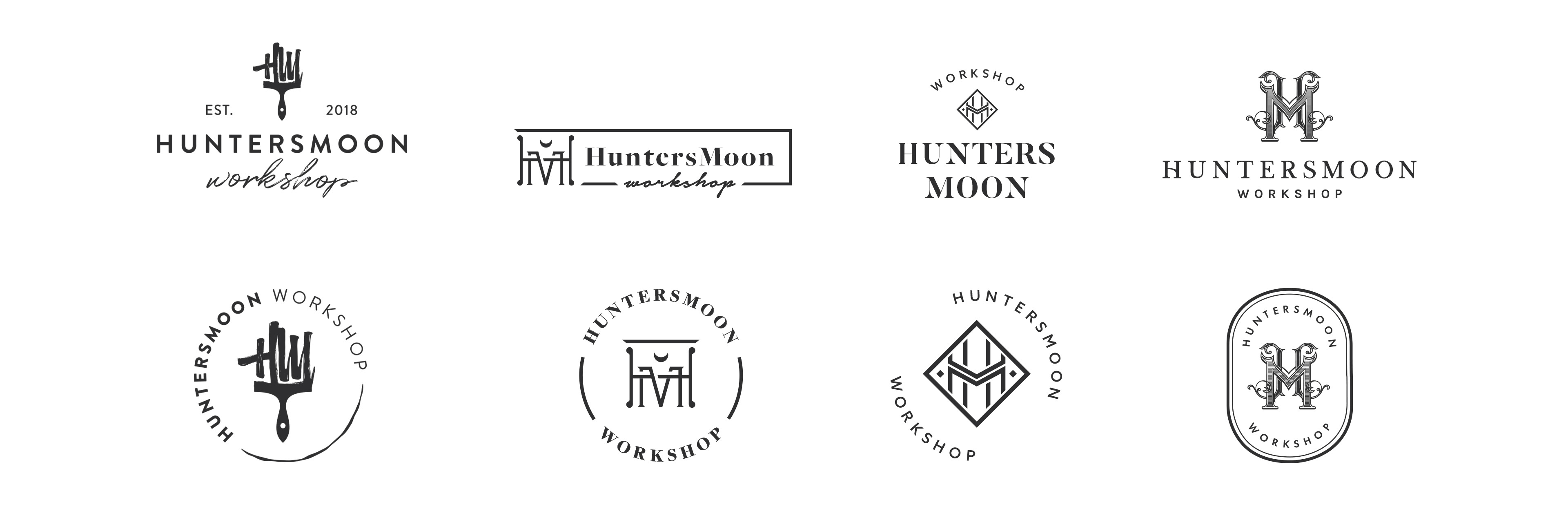
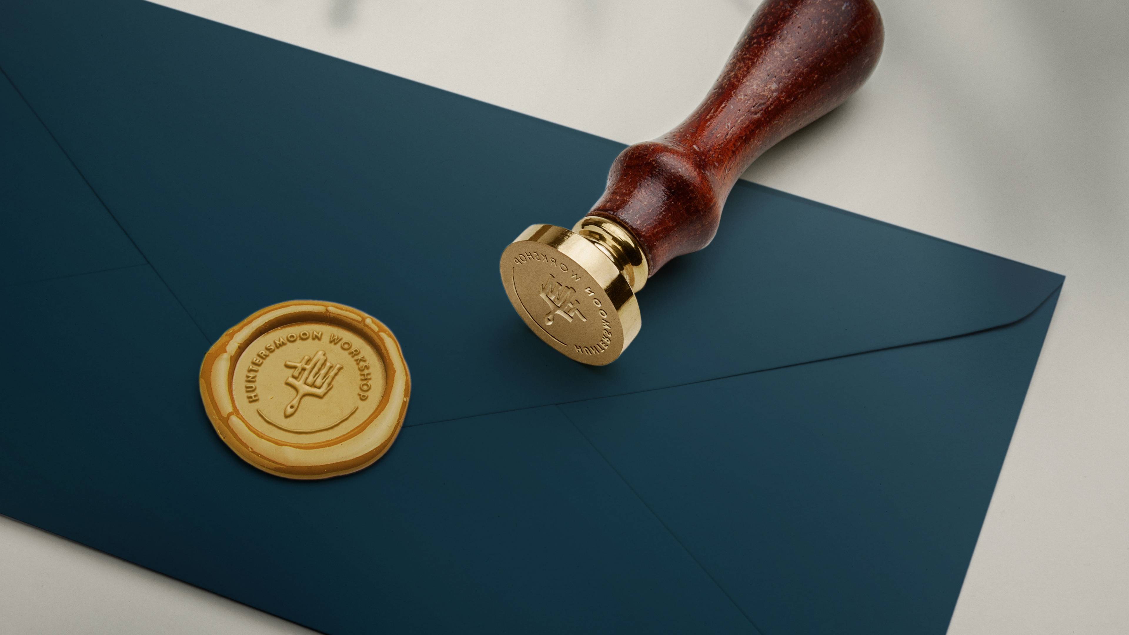
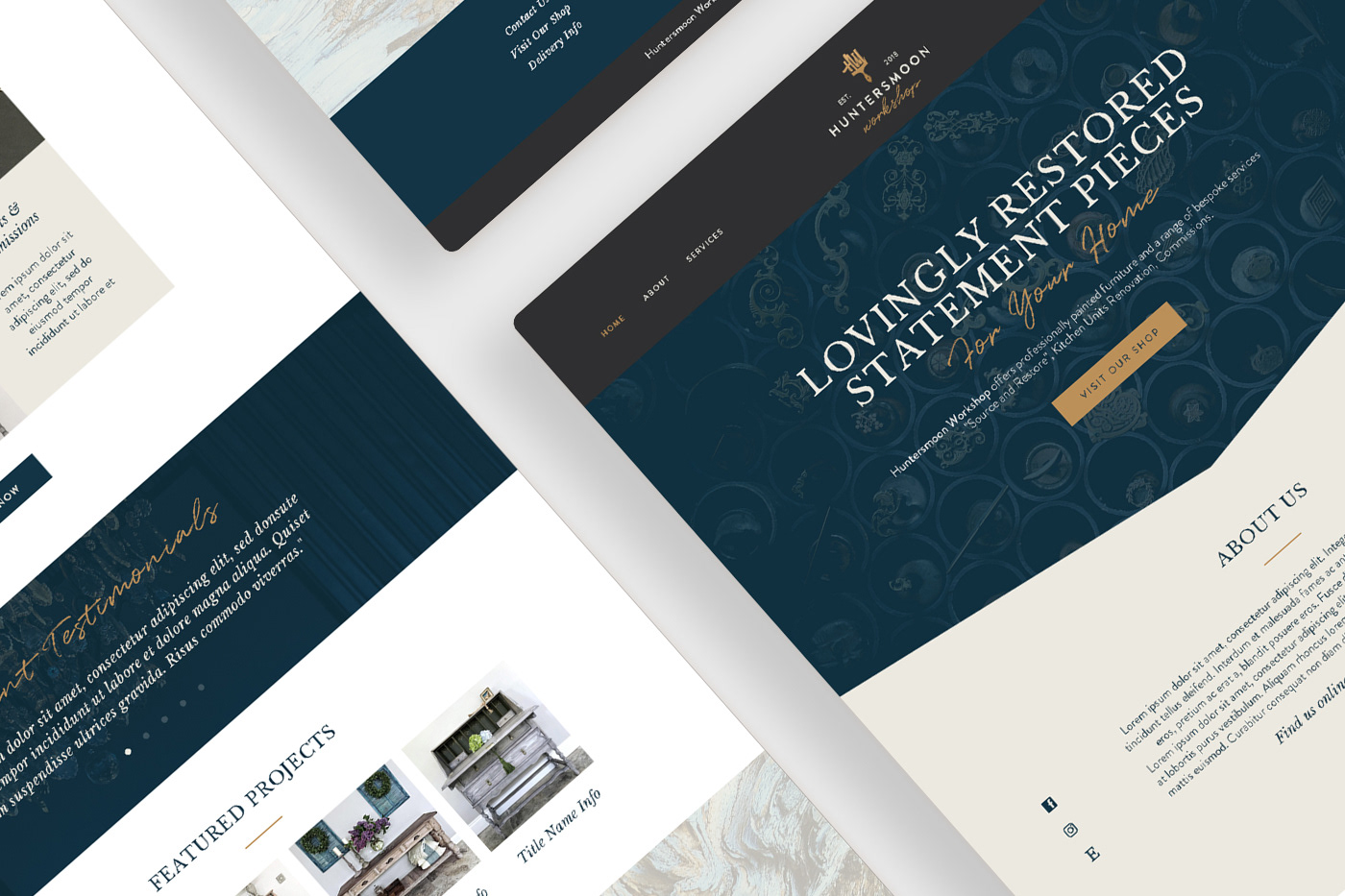
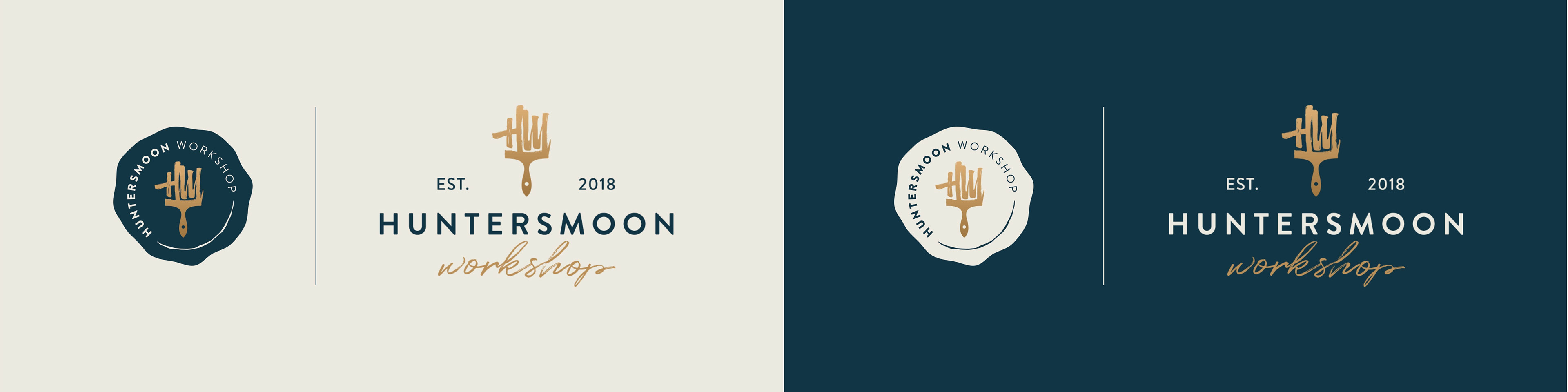
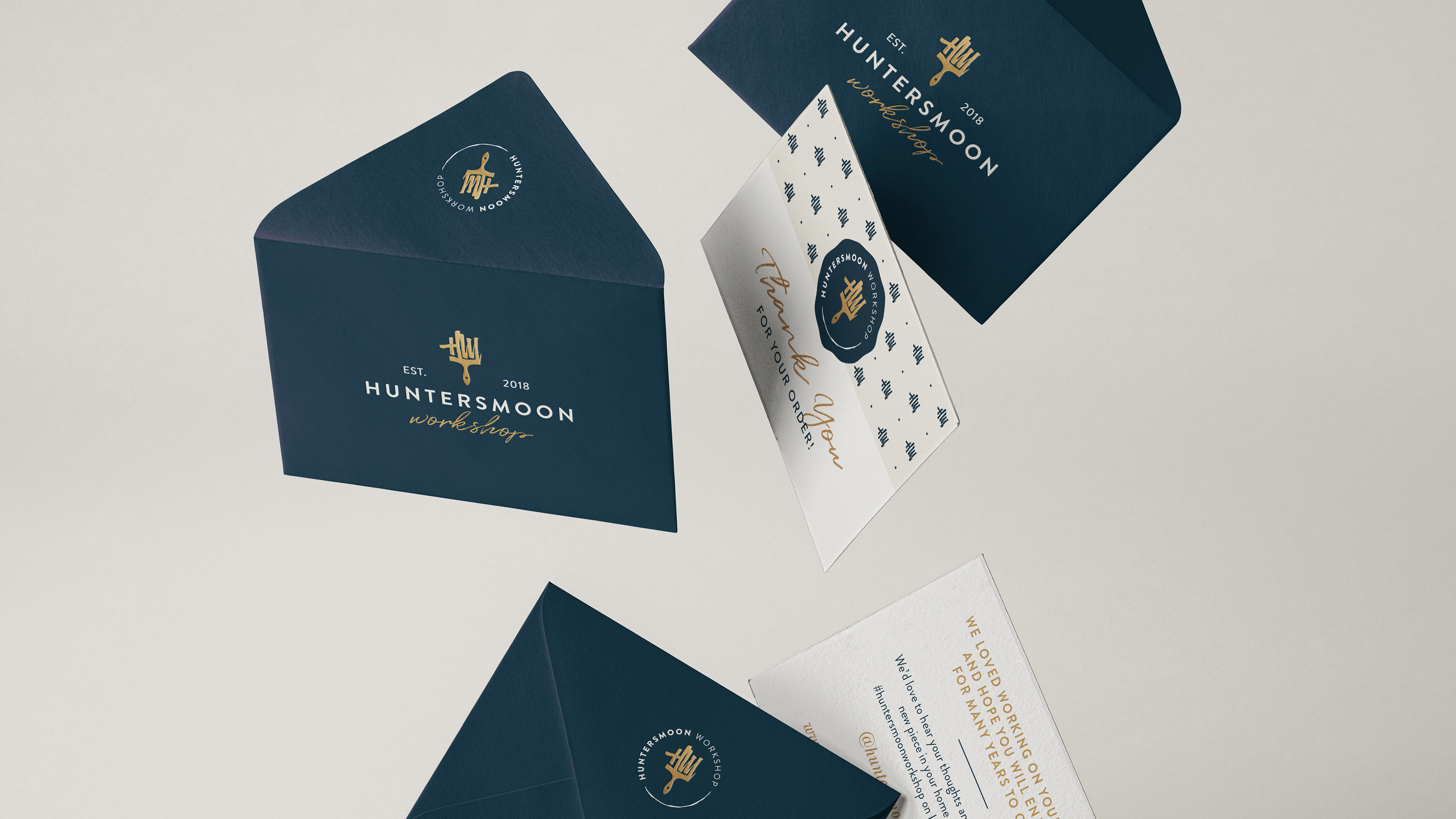
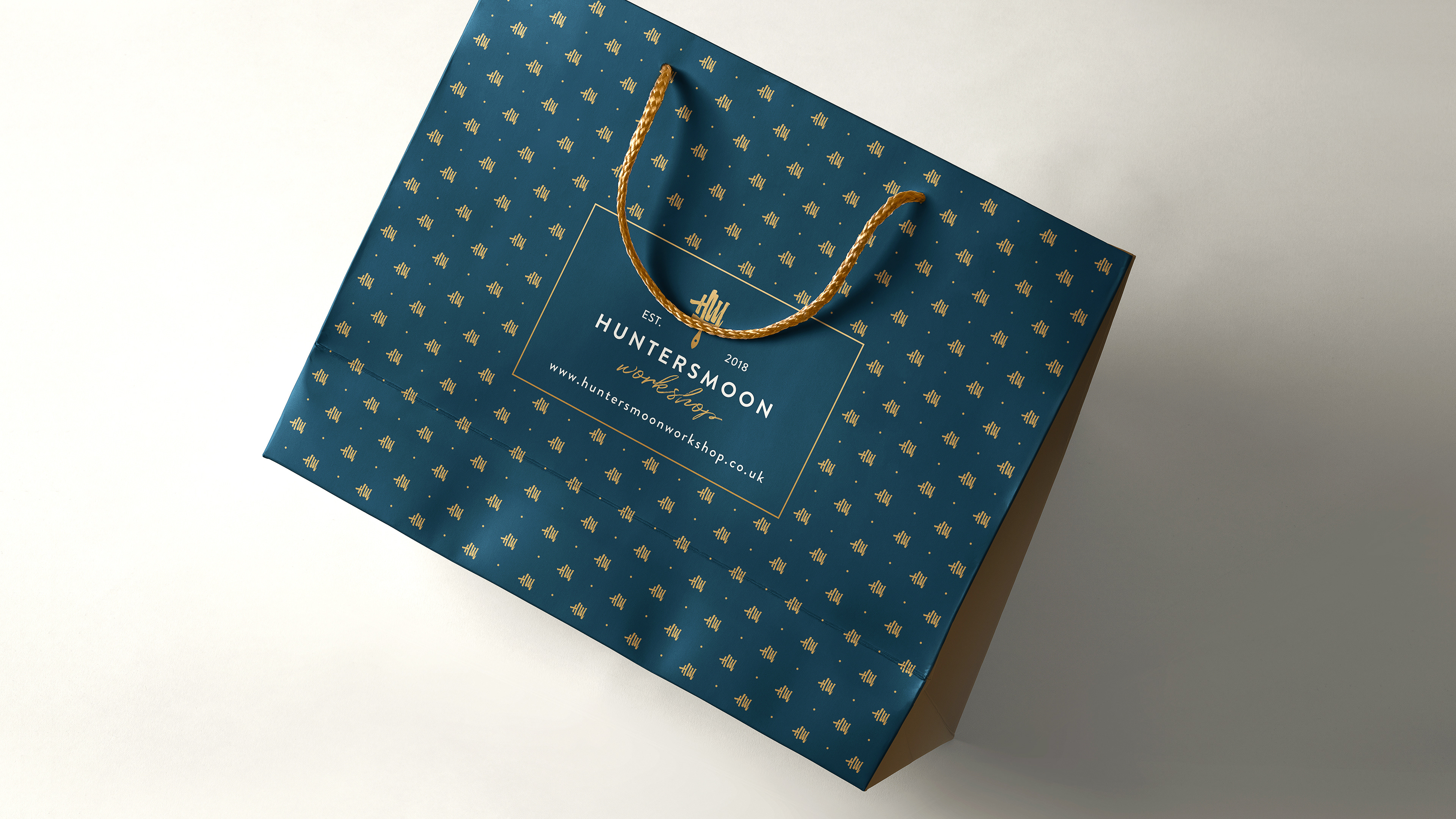
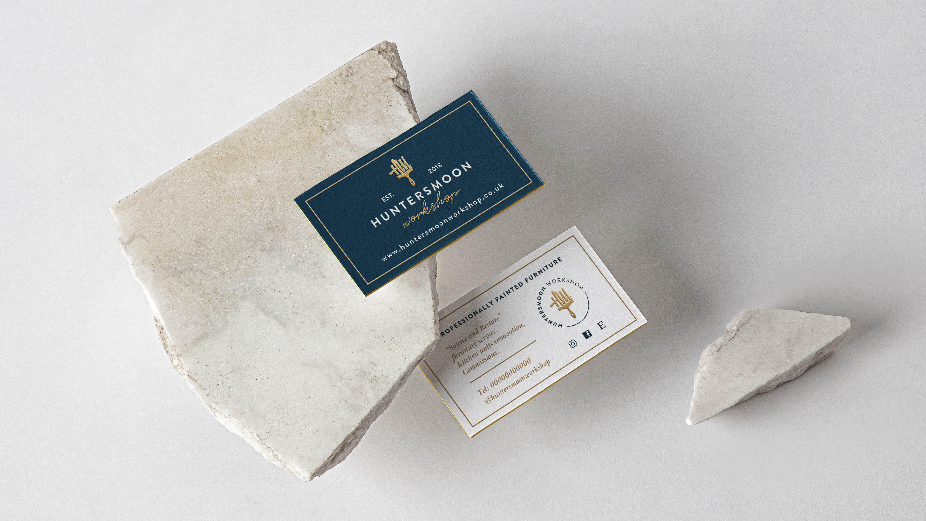
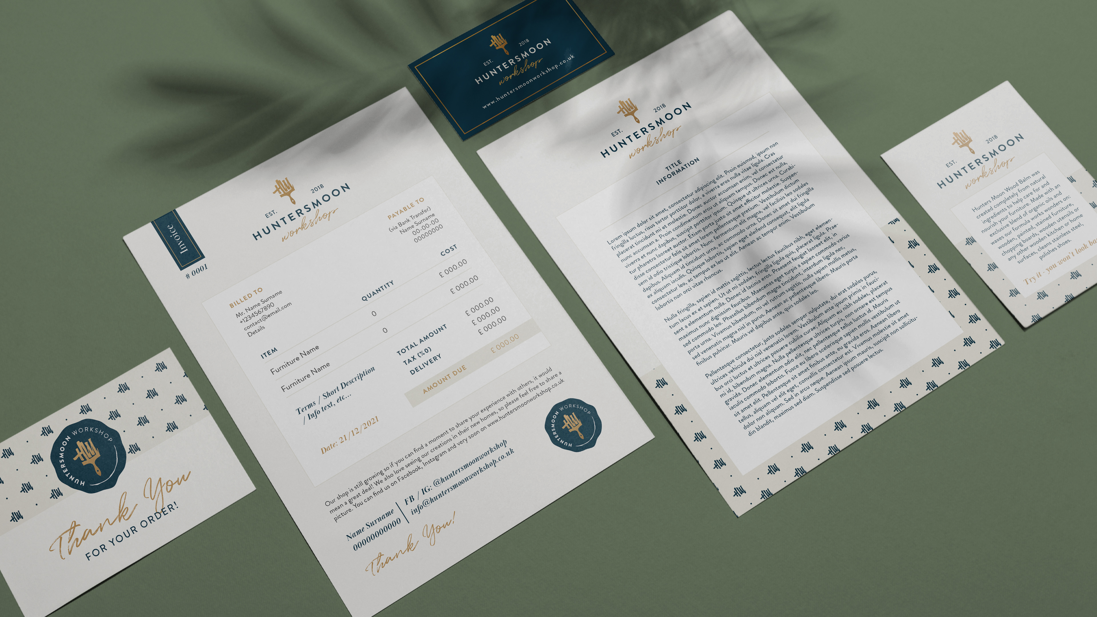
Branding / Logo
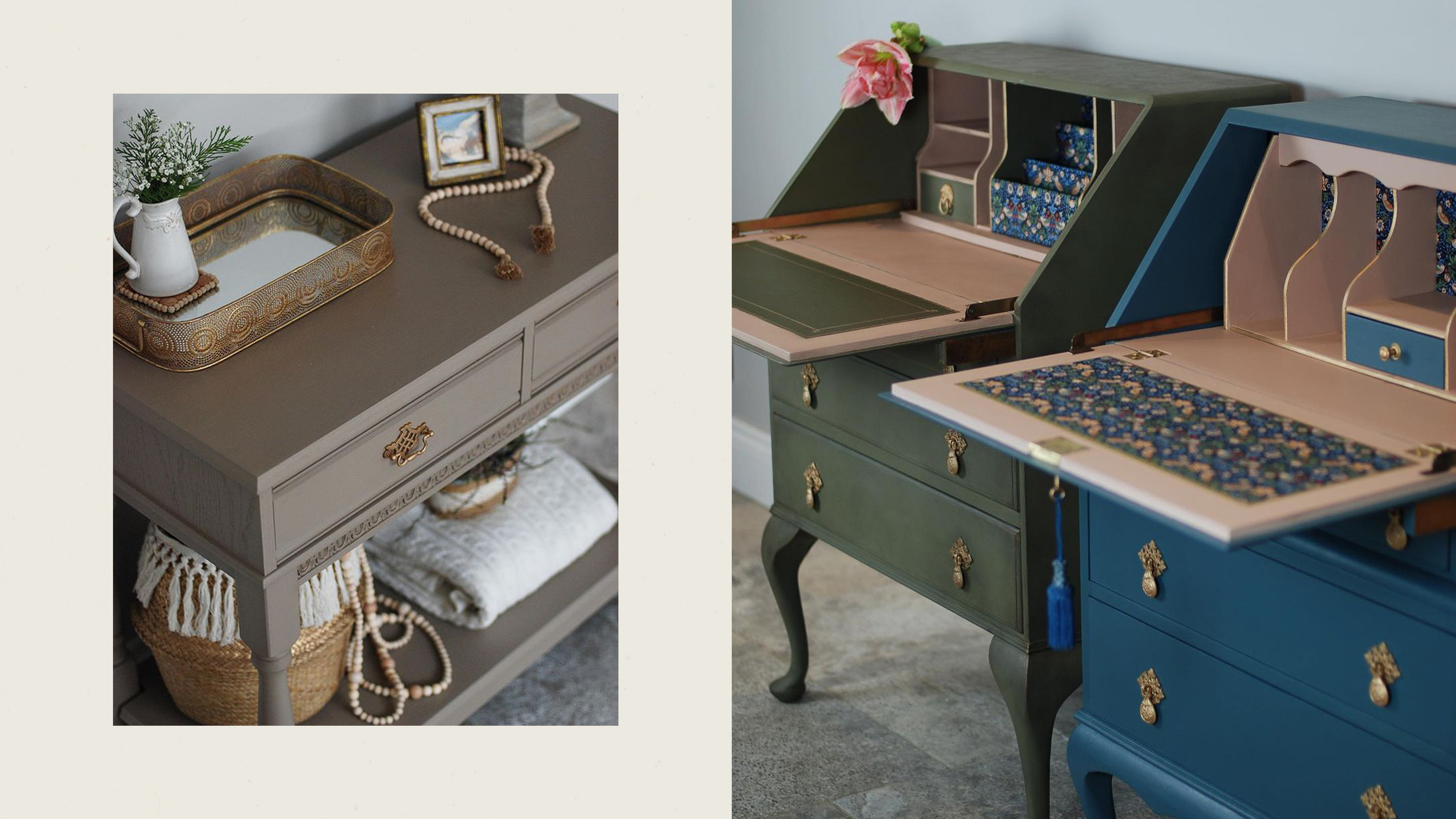
Hunters Moon Workshop is passionate about personalised restoration of antique, timeless, preloved furniture.
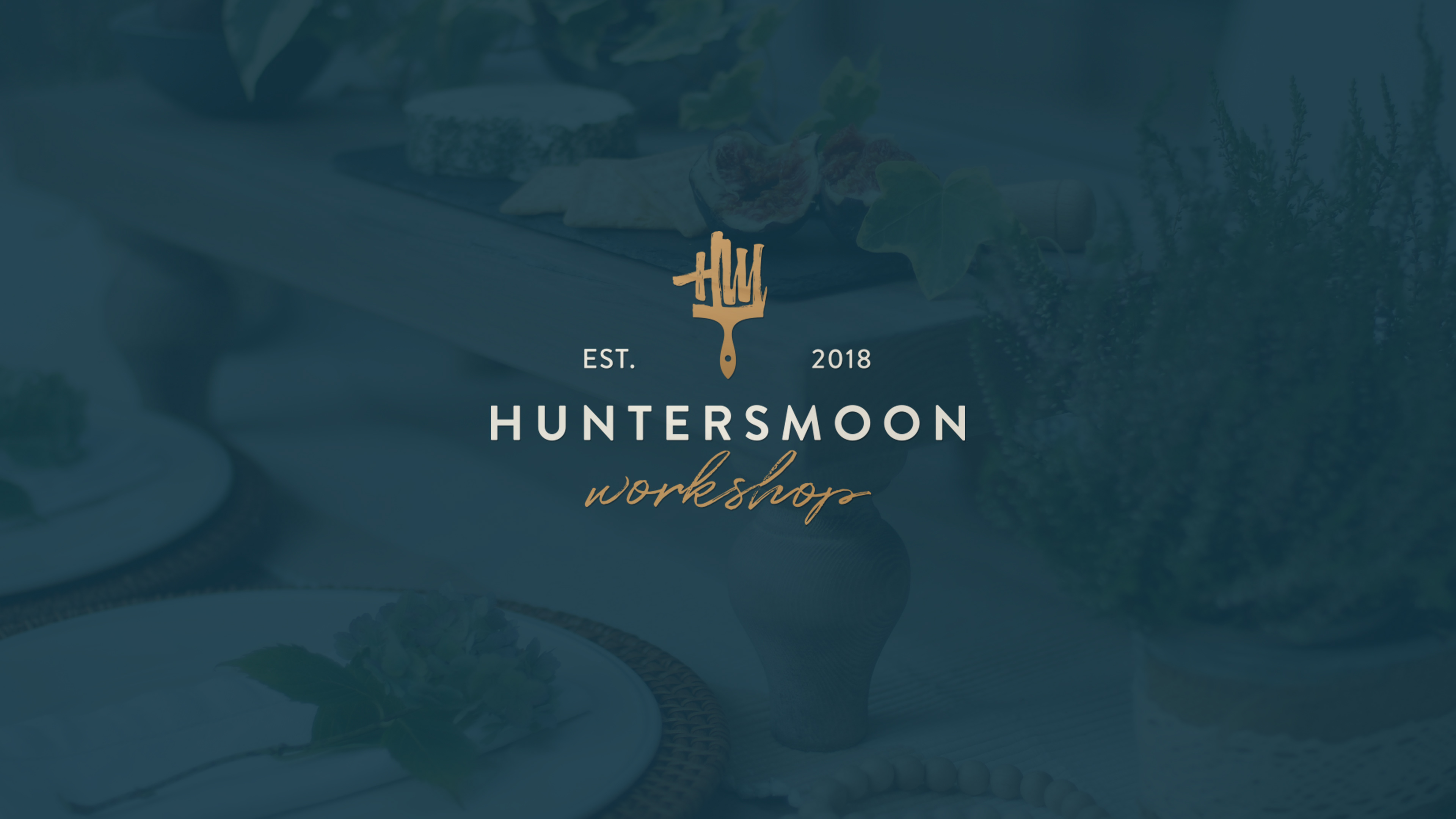
The concept behind the logo, a paintbrush with HM initials, convey a feeling of getting a personalised experience and endless possibilities. Whilst timeless fonts, bold colours with golden tones help communicate the brand values: Uniqueness, Creativity and Craftsmanship.
Semantics

Colour palette is consistent with Hunters Moon Workshop core values which embody simplicity, elegance and timeless style. The main colours are subtle, cool neutrals, whilst warm golden tones bring life to the antique furniture and brand collateral.

Typography is a balance between rounded friendliness with sharp angles, friendly and formal with vintage appeal and elegant longevity. Calligraphic typeface adds subtle personalised touch evoking trust.
Alternative Logo Concepts